I do fall into the camp of people who believe resumes should fit one page. This post will be dedicated to how to fit your resume onto one page using Microsoft Word (though the tips can be applied to other programs as well).
I don’t exactly know why, but I never loved looking at resumes that went onto two pages (if there wasn’t an absolutely critical reason for it). Most of the candidates I’ve screened/interviewed in my career have had under ten years of experience, and I really do feel that type of experience can be summarized on one page.
What it comes down to is this: as a recruiter, when you are screening hundreds of resumes at a time, you just want to get the picture and know the person’s story as quickly as possible (without the fluff)…
Assuming other recruiters feel the same way, that’s why I encourage one page resumes.
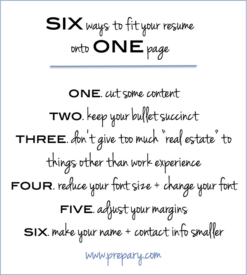
A lot of people come to work with me with two page resumes and I’ve always been able to get it down to one. Here are 6 ways (some basic tips & tactics) to fit your resume onto one page in Microsoft word.

- Cut out some content– It is very possible that you have experience on your resume that is outdated or not relevant, and it may be time to cut that out or minimize it.
- For example, once you’ve been in the working world for a few years, your internships (while in school) probably don’t need as much airtime. It can even make you come across “more junior” than you want to if you highlight them too much.
- Once you’ve had one or two full time jobs under your belt, put those experiences in another section called “Internship Experience” and just list them out without descriptive bullets (or take them out all together).
- Also, unless it is relevant to the roles you are applying for, remove any babysitting, bartending, or ice cream serving gigs that you took to save up money while in school or job searching.
- Keep your bullets succinct – You want the bullets detailing your experience to be relevant and succinct. They don’t need to be a laundry list of every task you’ve ever done in a job. Keep most sections between 3-6 bullets. Your most relevant jobs should have more bullets and shorter stints (that have less of an impact on your “story” should have less.
- Skills, volunteer experience, and hobbies don’t need to have a huge amount of real estate on your resume– You can list skills next to each other (versus in seperate bullets) and same thing with hobbies and volunteer experiences (example below).
- Skills: Mircrosoft Word, Excel, PowerPoint, Outlook, Taleo, Photoshop, AS400
- Hobbies: Biking, tennis, photography
- Volunteer experience: Junior League, Boys and Girls Club (one note on volunteer experience: if it is extensive and a big part of how you spend your time, consider having a separate section for it with more detail)
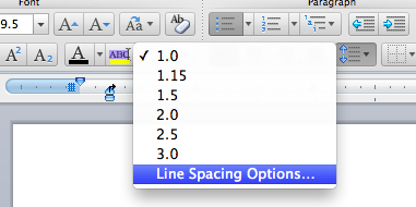
- Change your font style and size – Times New Roman size 9.5 or 10 is a font/size combination that is very clear and easy to read but also doesn’t take up a lot of space. If you feel like everything is looking a little “smushed” go to the paragraph settings and make the line spacing 1.1 or 1.2 (screenshot below). That can make it look a lot cleaner.

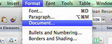
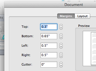
- Change your margins – Having wide margins (which is usually the default) is a huge waste of space, so don’t let that be the reason you resume is going onto page 2. To change your margins in Microsoft Word go to Format –> Document and then adjust the margins (screenshots below). I recommend the margins as follows: Top=.3 Bottom=.65 Right/Left=.5.


- Reduce the size of your contact info/address – Some people think this part of the resume needs to be “fancy” or huge, and it doesn’t. Make sure you name is in a slightly larger size than the rest of the resume (size 12 or 14 is fine) but no need to get crazy with the fonts or size.
Hopefully these tactics will help you fit your amazing experience onto one lovely page, something I assure you recruiters will appreciate. Have other tactics that have worked for you? Leave a comment to share your own tips!


